Is there a wrong way to use QR codes?
You bet. The majority of QR codes I’ve seen printed on products and in magazines aren’t going to work for a large segment of the QR enabled audience. Doing QR codes the wrong way isn’t forgivable. The risk of frustrating your audience and destroying confidence in your brand is real and probably higher than you’d guess. Doing QR codes the wrong way will have a substantial negative impact on your bottom line.
What is the most common mistake careless marketers make with QR Codes and how can you avoid being one of them?
Everybody has seen probably a dozen blog posts on QR codes now. Most of them I’ve seen have focused on how you can modify the design of the QR code to include your logo, or make it look like a recognizable shape. I don’t care so much about the way the codes look, for me the amazing part is how they work and what kind of promotional work can be done with them. As amazing as the opportunity is, so too is the cost of getting it wrong.
The One Giant Thing That Can Go Wrong With Your QR Code Campaign
The worst thing you can do with QR Codes is make them with too many pixels AND print them out too small. What does that mean? Why would too many pixels be bad? How small is too small?
Well, here we’ve got to get a little nerdy.
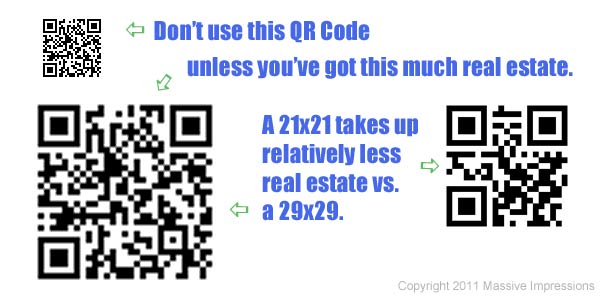
QR codes are recognizable by their distinguishable block shape filled with pixels that are either black or white, or some other color combination. There are several varieties of QR code – each defined by the number of rows and columns of block pixels that are used. The smallest variety, which actually looks the “chunkiest” is the 21×21 pixel QR code. The next variety involves a 25×25. It looks less “chunky” than the 21×21 because if you print them out at the same width and height next to each other it’s plain to see that the “grains” of the 25×25 are smaller than the 21×21. One easy to tell if you’ve got a 21×21 is the lack of the fourth, smaller square in one corner of the code.
21×21 QR codes are the only way to go. Here’s why:
I’ve got a iPhone 3G. Maybe something happened to the camera at some time, or maybe it was just a manufacturing glich. It doesn’t do too well taking close-up shots. It’s camera gets blurry when I try to shoot anything a foot or less away.
This has resulted in my inability to scan the majority of printed QR codes I’ve come across on products. Even some 25×25 QR codes that are printed too small are nearly impossible for me to scan.
 How can you avoid printing your QR Code with too many pixels?
Use shorter URLs. The shorter the data that is going into the QR Code, the fewer pixels will be needed. Use a URL shortener that gives you the shortest URL. It’s hard for me to recommend one particular URL shortening service because the number of characters each is using has historically varied over time. At Massive Impressions we’ve had to make our own URL Shortening domain 2vu.me that we use almost exclusively for QR Codes and URL Redirects. It’s come in pretty handy. You could do it yourself for your own company if you wanted to. It’s not rocket science.
Putting my propeller cap back on, I’m not going to leave the topic of shortening URLs for QR Codes without dropping this warning. Lots of the websites that let you use their QR Code generator use the Google Charts API to generate the QR Code graphic. Back when I put 2vu.me together I read the QR Code spec and noticed that the Google API wasn’t producing 21×21 codes when it should have. Google was forcing me to use only 10 characters in the URL as opposed to the 11 that I should have been able to generate a 21×21; it was cheating me out of one character. To remedy this I had to duplicate the Google Charts API within the 2vu.me instance. There are open source packages that make it easy.
How can you avoid making QR Codes too small?
Test them. Print them out at their intended dimensions. Try to scan them.
Do they scan well in low light? Do they have a proper margin around them?
Try a range of phones and mobile apps – know that getting it wrong could mean turning off an otherwise engaged and highly qualified lead. Don’t do it!
Most of all, be ready to pull your QR Code off your print piece if you’re being forced to make it smaller and smaller. Don’t sacrifice effectiveness for “looking edgy”. Don’t do it.
Did I scare you enough? Do you think it just might be better to go with the vanity URL instead of the QR Code in your next print piece?
Well hold on there – I didn’t say to throw the baby out with the bath water. QR Codes are still exceptionally powerful if done right.
My next post will explain what’s so powerful about QR Codes and why they should be part of your next campaign’s tactics.


This is a good post that is more technical than I got in my series on QR posts, but I liked what you added to the information. I didn’t know that a shorter URL makes the QR code more readable. Thank you.
You can get the same result by using http://uqr.me : you’ve got a single, short URL and you can attach any content to it and modify it when you want. Check it out and let us know!
Nice video explaining QR codes there at uqr.me.
Sweet site!
[…] Sad QR Code Failures & Tactics that DO Work | The Click Whisperer […]
Hey Jason, very interesting article!
Marius
Hi Jason,
Very interesting post!
Marius
Comments are closed.